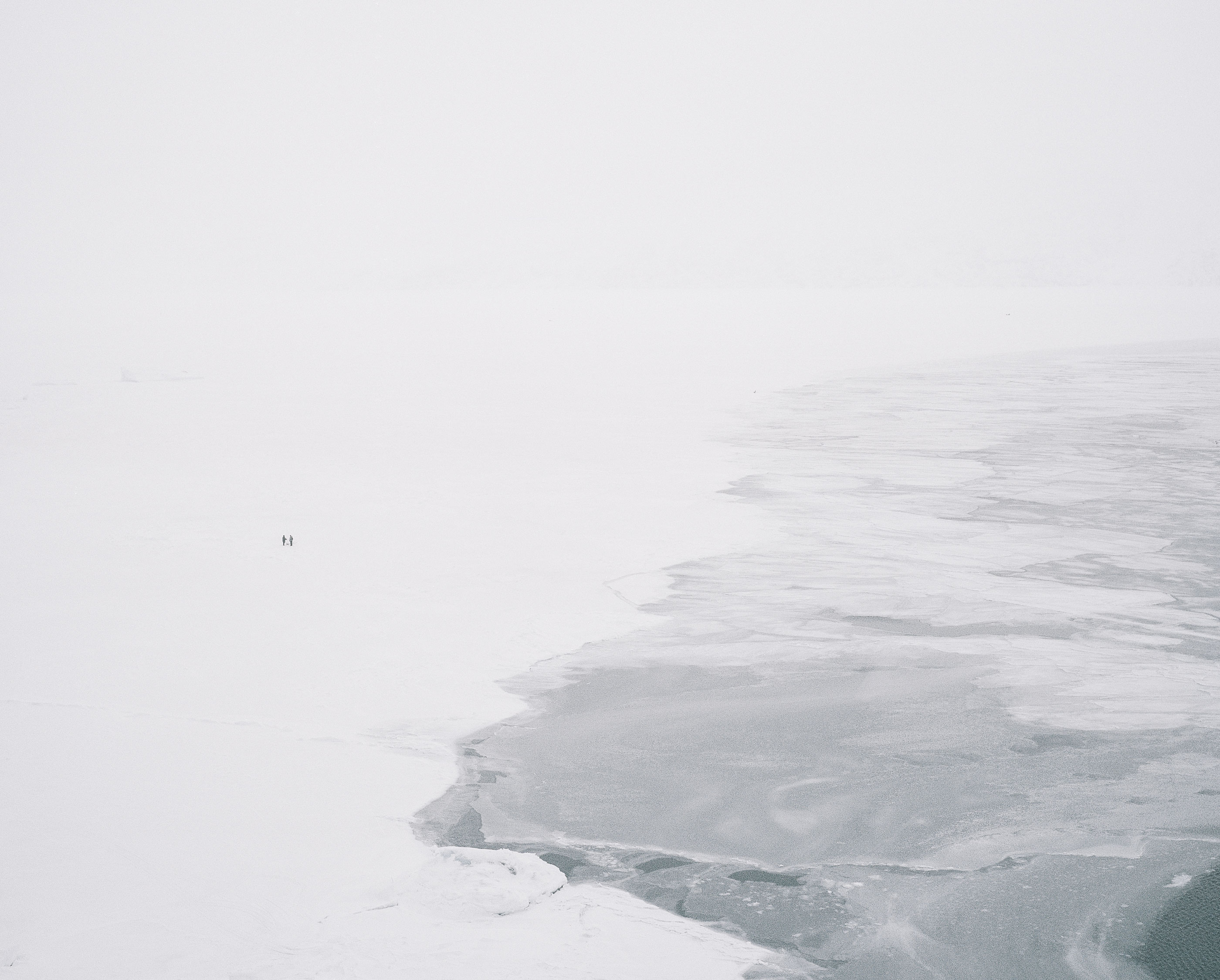
THE BIG MELT
A data-driven story of sea-ice decline by Lukas Kreibig
The Arctic Is Warming Nearly Four Times Faster Than the Global Average
Sea-Ice Melt Is Now Everyday Reality
The Place
How the Ice Is Vanishing
In the Arctic, sea ice is not just scenery. For many places it is route, workplace, and risk. What changes when that season becomes shorter and harder to trust?
Greenland
The world's largest island is mostly ice sheet. Along the rocky coast, deep fjords cut inland and create sheltered places where people have lived with the Arctic sea for millennia.
Uummannaq Bay
600 kilometers north of the Arctic Circle, this bay opens into one of Greenland's most dramatic fjord systems. In winter, the sea itself becomes the road.
Uummannaq Island
About 1,300 people live here beneath a distinctive heart-shaped mountain. In Uummannaq, ice is not scenery. It is mobility, timing, and safety.
The question is how that reliability is changing.
The Place
Heart of a Seal
Uummannaq takes its name from the mountain known as the Heart of a Seal. Beneath it, the town sits between harbor, fjord, and winter routes.
On the Ground
When the fjord freezes, the map changes. Routes that do not exist in summer become possible by sled, snowmobile, or on foot, but only while the ice can be trusted.
On the Ground
Fishing still shapes Uummannaq. But the story is not only climate loss: ice conditions, harbor access, markets, boats, and deliberate ice breakup all affect daily life.
The Voices
Voices from Uummannaq
In the Life on Thin Ice study, residents describe how winter ice, travel, hunting, and fishing are changing. Their observations are where this measurement begins.
The Measurement
Only a Feeling?
But how do you test an observation like that? From above. For years, ESA's Sentinel-2 satellites have passed over Greenland and captured the fjord: image by image, winter by winter, until they add up to a comparable record.
First, the view from above: this is Uummannaq as the satellite sees it.
Now the raw winter image. Scenes like this are the basis for the measurement.
Since 2017, ESA's Sentinel programme has provided regular images. Thousands of scenes have to become one consistent record.
A computer-vision pipeline reads each image. It masks clouds and land, then separates ice from open water.
The overlay is not the conclusion. It is the audit trail between satellite image, model, and chart.
The Measurement
One Winter, Day by Day
Watch one season fill in: the ice forms in February, holds through spring, then breaks apart by June. Each mark is one day, one satellite scene.
Memory Meets Measurement
Now all measured seasons are in view. Each row is one winter in Uummannaq; each small mark is one day.
The Earlier Measured Winters
The early years are the comparison point, not a perfect past.
The Later Measured Winters
The later years carry the summary value. It is a guide to the shift, not the whole explanation.
What the Chart Cannot Decide
Clouds, missing scenes, and local use remain part of the uncertainty. Weather, fishing economics, harbor access, deliberate ice breakup, and local knowledge all shape what ice means in practice.
The Pattern
Season by Season
Each small chart shows one Uummannaq ice season from February to June. The point is not one dramatic year, but the rhythm across years.
What the Record Shows
Across the measured years, the later seasons sit lower in the same calendar window.
Less ice in the measured season
The satellite record and local memory point the same way: earlier breakup, while leaving room for local causes and year-to-year variability.
The Pattern
When "Normal" Shifts
To make the shift legible, we compare the first four measured seasons with the later measured years.
When "Normal" Shifts
The blue line shows the 2017-2020 mean. The light band shows how much those years varied.
A Changed Season
The red line shows the 2021-2025 mean. In this comparison, the later years sit lower across much of the season.
That does not explain every local decision, but it does show that the physical season has shifted.
The Pattern
Back to the Opening Memory
The story began with a memory that spans a lifetime: as a child, the ice held into June or July. Nine years of satellite data is far too short to test a childhood recollection. But it can ask the same question in numbers. Each dot is the day one Uummannaq winter's ice broke up.
Earlier, on Average
Across the measured years, breakup moved from a late-May average toward mid-May, about eleven days earlier. It is a short, nine-year window, so read it as a direction, not a fixed date.
And Harder to Predict
The bigger change is the swing: recent winters break up as early as late April or as late as June. That matches the other thing residents stressed: the season has become less stable and harder to trust. The satellite and the people on the ice describe one change from two sides: one measures the area, the other lives the risk.
The Arctic
From Uummannaq to the Arctic
Uummannaq shows one local shift. The Arctic-wide record gives the scale: winter maximums, summer minimums, old ice, and rapid regional warming.
What Summer Leaves Behind
At the end of each summer the sea ice pulls back to its yearly minimum. Seen from above, decade by decade, the loss is unmistakable: the September minimum is shrinking by about 13 percent per decade.
The Arctic
The Arctic Seasonal Record
Each line traces one year of Arctic sea-ice extent, from autumn minimum to spring maximum and back again. Blue lines show older years, red lines show recent years.
1979–2000: The Cold(er) Half
The first half of the record sits visibly higher. The ice had more room to recover through the year.
2000 onward: The Recent Half
In the more recent years, the lines sit lower through much of the season.
Latest Available Year
Finally, isolate and compare it with the rest of the record.
Below the Earlier Range
Recent years often sit below the older envelope, especially around the winter maximum and late-summer minimum.
The Arctic
Six Decades, One Direction
Each colored band represents a decade of Arctic ice measurements. Watch them appear one by one and notice the unmistakable staircase downward. We open in the 1980s, the last decade before the losses dive below zero.
The 1990s: First Cracks
Each new decade settles slightly lower than the last. The changes seem gradual, but they're building momentum.
The 2000s: A Lower Baseline
For the first time, the curve spends much of the season below the older baseline. The shift is no longer subtle.
The 2010s: Acceleration
The decline steepens. Values around -0.6 million km² become common, territory that was unthinkable just decades earlier.
The 2020s: A Lower Range
The current decade sits near the bottom of the stack. The gap from the old baseline is especially clear late in the melt season.
The data shows no short-term return to the older range.
The Arctic
Below the Average
Each bar shows how much above (blue) or below (red) the long-term average that year finished. Think of zero as the "normal" line.
The 1980s and 90s still moved around the average. From the 2000s onward, negative years become the rule rather than the exception.
The single-year view tells the same story: the baseline has moved lower.
The Drivers
The Warming Signal
Three lines, one story: global CO₂ emissions (green), global temperature (blue), and Arctic temperature (red) have climbed for decades.
The physical link is well established: more greenhouse gases trap more heat. In the Arctic, that warming shows up especially strongly.
The Arctic is an early warning system because regional change there connects back to weather, oceans, and climate elsewhere.
The Drivers
Apples to Apples
How do you compare CO₂ emissions (measured in tonnes) with temperature (degrees) and ice extent (square kilometers)?
By converting each series to the same kind of distance from its own historical average. Different units become comparable without pretending they are the same.
The Mirror Image
When we flip the ice-loss data upside down, the pattern becomes easier to compare: rising CO₂ and temperature move against falling ice.
Three different measurements do not become the same thing. They become readable on the same scale.
The Drivers
: The Latest Comparison
In the latest available year, , the Arctic temperature anomaly sits well above the global mean.
The red bar is more than a number. It shows how unevenly warming is distributed.
The comparison is a reminder that global averages can hide sharp regional change.
Scientists forecast ice-free Arctic summers before 2050
The Arctic is the planet's canary.
Will we listen?
Listening is not the same as measuring.
The satellites count the ice. The people of Uummannaq live with what its absence takes: routes, timing, trust, a way of being on the sea. The record here is nine years; the memory is a lifetime. Both point the same way.
The future is unwritten. What we make of the measurement and the memory is the open question.
Lukas Kreibig
Data journalism, coding & visual design.
© 2026 – All rights reserved
Contact
Phone: +49 (0) 176 444 69 498
Email: lukas.kreibig@posteo.de
Sources & Methodology
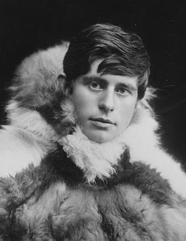
Chat with Knud Rasmussen
This AI chatbot is trained on the 'Eskimo Folk-Tales', a unique collection of Greenlandic legends and myths gathered by Danish-Greenlandic polar explorer Knud Rasmussen (1879-1933) during his legendary Thule Expeditions.
Known as the 'Father of Eskimology,' Knud Rasmussen conducted groundbreaking expeditions across the Arctic from 1912-1924. Fluent in Greenlandic, he collected over 20,000 pages of Inuit oral traditions and stories of spirits, shamans, hunting, and Arctic life.
The 'Eskimo Folk-Tales' contain hundreds of stories: from Tulugaq the great raven who brought light to the world, to Sedna the sea goddess. These tales offer unique insights into the spiritual world of the Inuit.